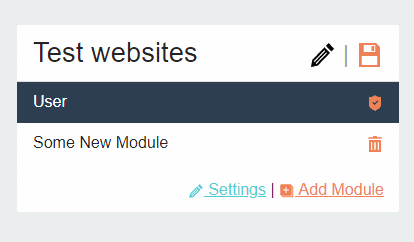
If you are using cards in your apps, there is a good chance you need to have buttons on the right top within the header. Below snippet will help you to align buttons or icons in the card header right.
<div class="card"> <div class="card-header d-flex justify-content-between"> <h4 class="card-title m-0">Fields</h4> <div> <a href="#" class="h4 text-success"> Delete </a> <a href="#" class="h4 text-danger" title="Add new field" > <i class="icon svg-icon"> Add Field </i> </a> </div> </div> <div class="card-body"> Some content goes here </div> </div>
Here we use flex utils to align the content within the headers. The util class justify-content-between separates the header and button section. We have grouped buttons inside a div for them to appear together in the right. You can learn more about the options in flex utils in bootstrap documentation at https://getbootstrap.com/docs/5.0/utilities/flex/#justify-content
This extract is from my CodeIgniter website generator new design. Here is how it appears in my website.

Leave a Reply