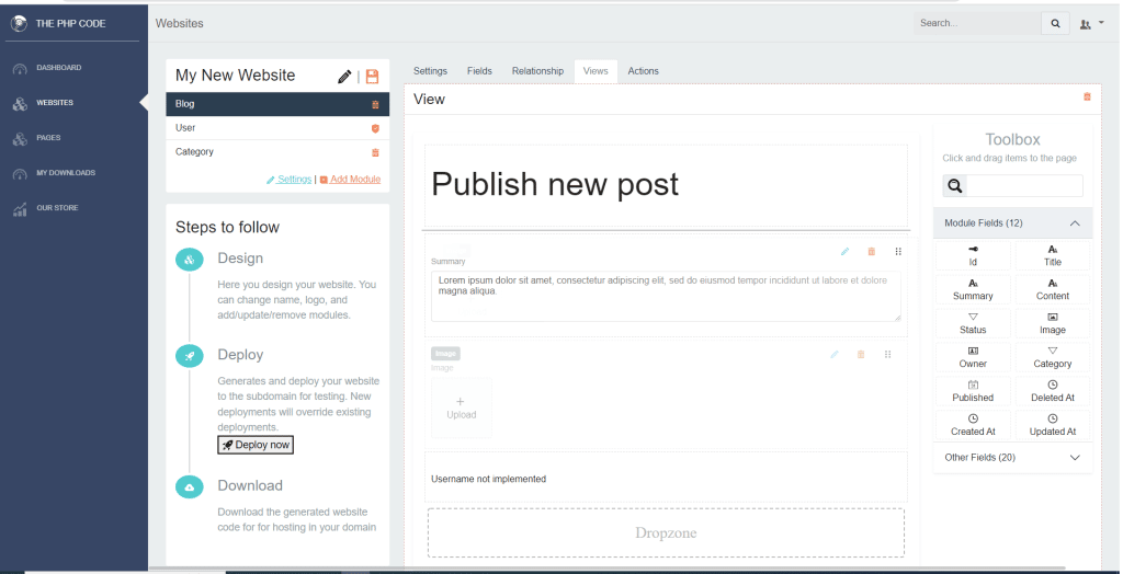
I am working on a form builder which is part of my CodeIgniter 4 website builder going to be available at https://thephpcode.com. The current website builder uses old UI and generates website in CodeIgniter 3. While doing that I had many challenges as I was using the React DnD for the first time. Here I will explain the challenges and how I overcome. Before going in to the details here is the screenshot of what I am building now.

What was the challenge?
One of the main challenge I encounter was I had to pass some data from hover function to the drop function. Because based the position where the item is dropped inside the form I had to add the item above or below related to the dropped over item. I had tried to keep the detail in the state but the state is lost as soon as the item is dropped so what ever the value set by hover function is not accessible by the drop function. After spending more time I came across a work around to use the monitor instance as the same instance is passed back to the drop function. So if I set a value to the monitor instance I could access the same inside the drop function. The code I used was looked something below. This may not be ideal way but works best for the situation.
 const [{ canDrop, isOver }, drop] = useDrop(
    () => ({
      accept: ItemTypes.CARD,
      drop: (item, monitor) => props.moveItem(item, monitor.dropTarget),
      collect: (monitor) => ({
        isOver: monitor.isOver(),
        canDrop: monitor.canDrop(),
      }),
      hover(item, monitor) {
        if (!ref.current) {
          return;
        }

        const dragIndex = item.index;
        const hoverIndex = index;
        // Don't replace items with themselves
        if (dragIndex === hoverIndex) {
          return;
        }
        // Determine rectangle on screen
        const hoverBoundingRect = ref.current?.getBoundingClientRect();
        // Get vertical middle
        const hoverMiddleY =
          (hoverBoundingRect.bottom - hoverBoundingRect.top) / 2;
        // Determine mouse position
        const clientOffset = monitor.getClientOffset();
        // Get pixels to the top
        const hoverClientY = clientOffset.y - hoverBoundingRect.top;
        // Only perform the move when the mouse has crossed half of the items height
        // When dragging downwards, only move when the cursor is below 50%
        // When dragging upwards, only move when the cursor is above 50%
        // Dragging downwards
        if (dragIndex == hoverIndex - 1 && hoverClientY < hoverMiddleY) {
          setDropOverClass("");
          return;
        }
        // Dragging upwards
        if (dragIndex == hoverIndex + 1 && hoverClientY > hoverMiddleY) {
          setDropOverClass("");
          return;
        }
        // Time to actually perform the action
        // moveCard(dragIndex, hoverIndex);
        if (hoverClientY < hoverMiddleY) {
          monitor.dropTarget = hoverIndex;
          setDropOverClass("top-droppable");
        } else {
          monitor.dropTarget = hoverIndex + 1;
          setDropOverClass("down-droppable");
        }
      },
    }),
    [props.items, props.item]
  );
If you see the bolded text in the above code you can understand how I pass values from the hover action to the drop action.
The other challenge I encounter was to display some hint row to the users when they are about to drop an item to indicate where it will be added or moved. If the item is dropped above mid horizontal line, I was adding the dropped item above the dropped over item otherwise after that. For that I had to display some hint row so that user will know where the item will be displayed even before they drop the item. For implementing this I used the hover function and dynamically added a class based on where the item is dragged and used the class to to dynamically show and hide hint sections above or below the hovered item. You can see in the above code that I set top-droppable or down-droppable class to the component state. I refer the state in the rendered display as shown below.
 return (
    <div ref={ref} className={isOver ? DropOverClass : ""}>
      <div className="drop-here-top"></div>
      <div className="item" ref={preview} style={{ opacity }}>
        <ItemHeader {...props} drag={drag} />
        {getSpecificComponent()}
      </div>
      <div className="drop-here-bottom"></div>
    </div>
  );
See the bolded text in the above returned display which refers the DropOverClass.
Hope this gives you some idea in similar situation. Please feel free to ask if you got any question I can help you with that.
Leave a Reply