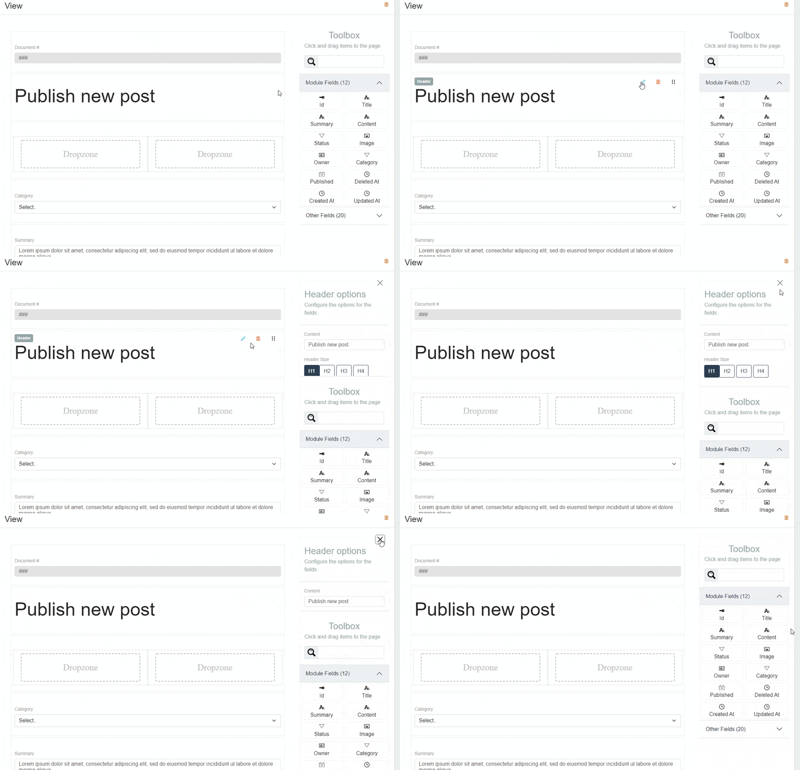
This small tutorial for anyone want to implement a show and hide animation for widgets with simple script and help of some css styles. The final animation will be similar to you see below.

If you are setting height values for a div element and the transition set to animate in css for the div then browser will handle the animation for you.
<div class={"card" + isHidden ? " hidden" : ""}>
Your widget content goes here
</div>
in css style for card you will do the following
  .card {
    height: 100px;
    transition: all 1s ease;
  }

  .hidden {
     height: 0;
  }
The above code will function but you will run in to some issues. First issue is you don’t know the height of the content if the content is changing within the card. Also the text will reflow when the height is changing will not be a nice experience to the user watching the height change.
We can improve this experience easily using useEffect hook and by adding a container div covering the content div. We keep the content div without setting any height. So the content div sets to the height of the actual content. in the useEffect hook as soon as the card component is loaded we set the height to the height of the content div. Also we set the overflow on the container div to hidden. Here is the sample code.
import React, { useEffect, useRef } from "react";

const Widget = (props: {
  closeOptions: Function,
  hideFieldOptions: boolean,
}) => {
  const { hideFieldOptions, closeOptions } = props;
  const cardRef = useRef(null);
  const contentRef = useRef(null);

  useEffect(() => {
    if (!hideFieldOptions) {
      cardRef.current.style.height =
        contentRef.current.getBoundingClientRect().height + "px";
    } else {
      cardRef.current.style.height = "0px";
    }
  }, [hideFieldOptions]);

  return (
    <div className="widget" ref={cardRef}>
      <div ref={contentRef}>
        <div className="d-flex justify-content-end">
          <div>
            <a
              href="#"
              className="btn btn-primary"
              onClick={(e) => {
                e.preventDefault();
                props.closeOptions();
              }}
            >
              Close
            </a>
          </div>
        </div>
        <div>{"... your widget content goes here"}</div>
      </div>
    </div>
  );
};

export default Widget;
  .widget {
    height: 0px;
    transition: all 1s ease;
    z-index: 1;
    overflow: hidden;
  }
Hope this helped you to implement your widget. If you get in to any trouble please feel free to add a comment. I will definitely help on that. Happy coding..
Leave a Reply